3 Min.The employer brand, often also referred to as an employer brand, is currently being talked about again. In view of the dynamic developments on the job market, it is becoming increasingly important. Companies are realizing this: If you want to attract the right employees today, you have to offer more than just a job advertisement.
This is no longer just about recruiting junior staff. It has become at least as important to attract experienced specialists and retain them in the long term. Particularly in times of high willingness to change jobs, the overall image of a company often determines whether talented people decide for or against an employer.
New opportunities in a turbulent labor market
Compared to the time before the coronavirus pandemic, the labor market has changed noticeably. Career paths are now much more flexible than they were a few years ago. Industry changes that used to be considered unusual are no longer a rarity.
New doors open up, especially if the topics are close and the qualifications are suitable – even in later career years. For example, specialists are moving into areas such as mobility and logistics or working at exciting interfaces between pharmaceuticals and medical technology. This is a great opportunity for companies: the talent pool is now more diverse than ever before.
Authenticity beats high gloss
While highly standardized brand appearances used to dominate, the communication of employer brands has also changed. Authenticity plays a much greater role today.
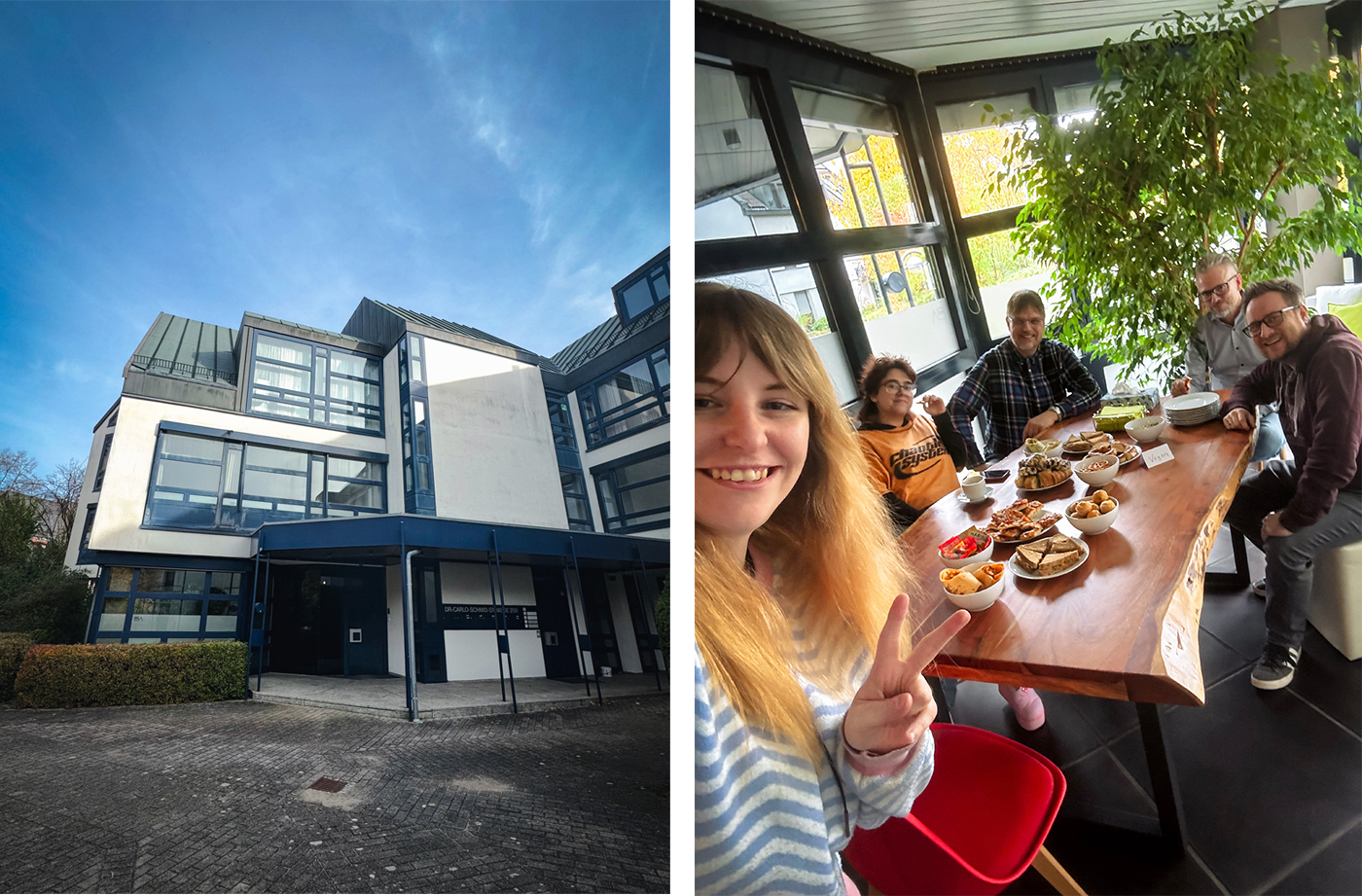
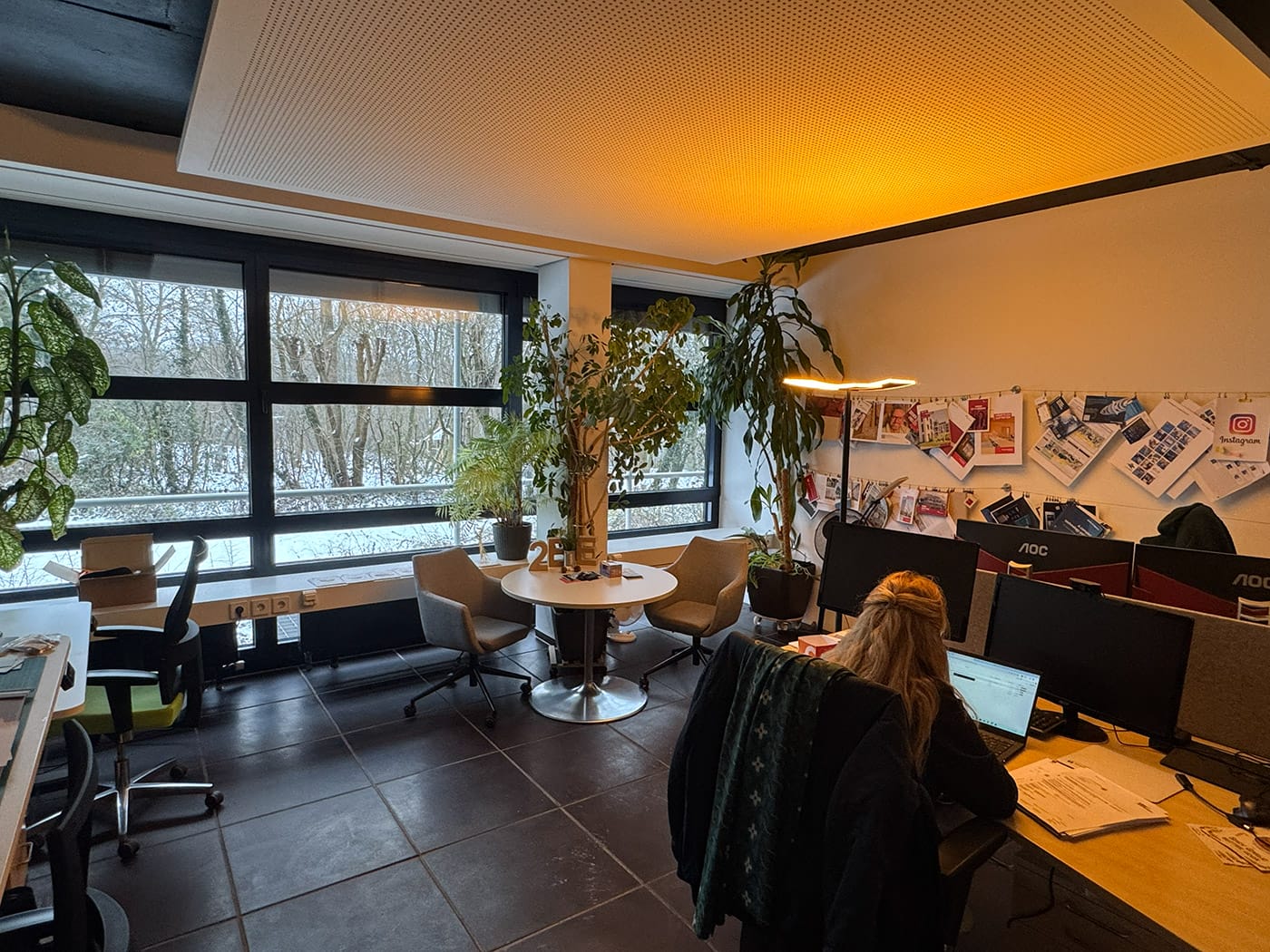
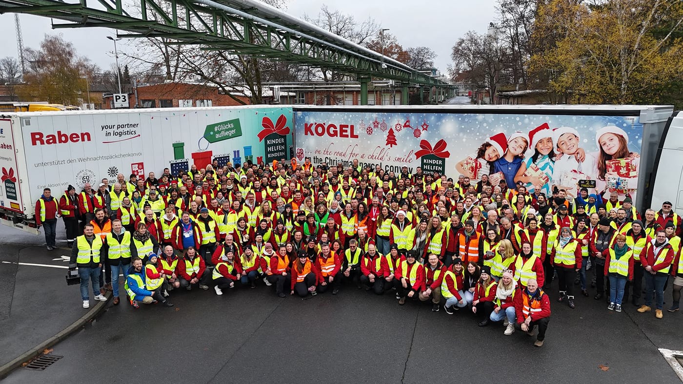
Perfekt inszenierte Imagekampagnen mit glatten Oberflächen wirken schnell austauschbar. Marken, die nur auf Hochglanz setzen, schaffen es immer seltener, nach außen wirklich durchzudringen. Gerade in sozialen Medien wird eine zu perfekte Außendarstellung schnell kritisch hinterfragt. Unternehmen sind deshalb gut beraten, echte Einblicke in ihre Unternehmenskultur zu geben. Mitarbeitende, Arbeitsalltag und gelebte Werte dürfen sichtbar sein – auch mit kleinen Ecken und Kanten. Genau das schafft Vertrauen.
The focus of many skilled workers has also shifted when it comes to choosing an employer. A good salary is of course still important – but it is no longer the only deciding factor.
More and more people are paying attention to how people treat each other in a company. Appreciation, team spirit, development opportunities and a positive working atmosphere play a key role. Companies that actively look after their employees and cultivate a strong internal culture have a clear advantage in the competition for talent.
Making strengths visible
However, all these qualities must also be communicated to the outside world. A strong employer brand is not created by chance – it is strategically developed and continuously maintained. Those who authentically show what the company stands for, which values are practiced and what employees really expect create trust and interest among potential applicants.
How do you achieve this? It’s simple: talk to us – we will help you to make your employer brand visible and tangible.
—
Curious now?
Our contact persons will be happy to help:

Matthias Brinkmann
+49 911 47494949
brinkmann@twobe.de
LinkedIn


